--ImageRemoved--
I am dying to know. One space or two after a period?
Also, Mr. Seal O. Cust, I would hire the person behind that resume if I ever worked at a big enough shithole where they let me do the hiring.
Resume Font Forum
Forum rules
Anonymous Posting
Anonymous posting is only appropriate when you are revealing sensitive employment related information about a firm, job, etc. You may anonymously respond on topic to these threads. Unacceptable uses include: harassing another user, joking around, testing the feature, or other things that are more appropriate in the lounge.
Failure to follow these rules will get you outed, warned, or banned.

-
Anonymous User
- Posts: 428443
- Joined: Tue Aug 11, 2009 9:32 am
Re: Resume Font
Do you think italics still looks okay in Garmond? I had Times but I'm thinking of changing it to Garmond... my employer info is in italics though
-
Geist13

- Posts: 739
- Joined: Sat Oct 10, 2009 3:21 pm
Re: Resume Font
Font - Times (classic and effective, just like me)
Style - Bold & All Caps for section headings (e.g. EDUCATION); Bold & regular capitalization for items within each heading (e.g. Harvard Law School and United States Attorney's Office); italics for position title in experience section (e.g. Law Clerk)
Size - 12 pt.
Bullets - No fucking way
Style - Bold & All Caps for section headings (e.g. EDUCATION); Bold & regular capitalization for items within each heading (e.g. Harvard Law School and United States Attorney's Office); italics for position title in experience section (e.g. Law Clerk)
Size - 12 pt.
Bullets - No fucking way

Want to continue reading?
Register now to search topics and post comments!
Absolutely FREE!
Already a member? Login
-
071816

- Posts: 5507
- Joined: Thu Mar 31, 2011 8:06 pm
Re: Resume Font
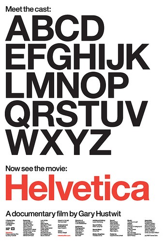
I actually watched this feature-length independent film about typography, graphic design and global visual culture. Ever since then, I pay a lot of attention to fonts.
My resume is in Garamond (10.5) font. This could change, though, if I find something better. I'm still experimenting.
My resume is in Garamond (10.5) font. This could change, though, if I find something better. I'm still experimenting.
-
denimchickn


- Posts: 62
- Joined: Tue Nov 30, 2010 11:57 pm
Re: Resume Font
16.5 pt yellow Comic Sans with a black background for the body. You really want your credentials to pop out at them.
18.5 pt magenta Wingdings for the headers. If they really want you to work there, the least they can do is take the time to change them into an alphanumeric font.
Also, be sure to strikethrough any employment that you do not currently hold. Not doing so could send the signal that you still work there, which many employers would find misleading.
-
Cupidity


- Posts: 2214
- Joined: Sun Jun 07, 2009 10:21 pm
Re: Resume Font
Here, Here! Bullets are for people who don't have material to fill the page!Geist13 wrote:Font - Times (classic and effective, just like me)
Style - Bold & All Caps for section headings (e.g. EDUCATION); Bold & regular capitalization for items within each heading (e.g. Harvard Law School and United States Attorney's Office); italics for position title in experience section (e.g. Law Clerk)
Size - 12 pt.
Bullets - No fucking way
-
NZA

- Posts: 1269
- Joined: Fri Nov 19, 2010 10:01 pm
Re: Resume Font
Great film, though you wouldn't want a sans-serif on a resume.chimp wrote:I actually watched this feature-length independent film about typography, graphic design and global visual culture. Ever since then, I pay a lot of attention to fonts.
My resume is in Garamond (10.5) font. This could change, though, if I find something better. I'm still experimenting.
Garamond strikes me as too childish. Georgia may well be TCR, and it's available on most all computers.
The fact of the matter is, though, that the size of the type on a resume is going to make any significant differences between various fonts unnoticeable.
-
071816
- Posts: 5507
- Joined: Thu Mar 31, 2011 8:06 pm
Re: Resume Font
Really? Garamond strikes me as classy.NZA wrote:Garamond strikes me as too childish.
-
NZA
- Posts: 1269
- Joined: Fri Nov 19, 2010 10:01 pm
Re: Resume Font
Yeah...maybe it's because I used Garamond when I was 12ish on my class papers. I guess I just associate it with junior high.chimp wrote:Really? Garamond strikes me as classy.NZA wrote:Garamond strikes me as too childish.
Again, I'd argue that appreciable differences are going to be non-existent when you finally print it.
-
Oban
- Posts: 644
- Joined: Sun Sep 06, 2009 12:09 pm
Re: Resume Font
My resume has been in Helvetica since i graduated 3 years ago, I make sure to imbed fonts and/or save it as a PDF so it doesn't convert into an Arial shitshow.NZA wrote:Great film, though you wouldn't want a sans-serif on a resume.chimp wrote:I actually watched this feature-length independent film about typography, graphic design and global visual culture. Ever since then, I pay a lot of attention to fonts.
My resume is in Garamond (10.5) font. This could change, though, if I find something better. I'm still experimenting.
Garamond strikes me as too childish. Georgia may well be TCR, and it's available on most all computers.
The fact of the matter is, though, that the size of the type on a resume is going to make any significant differences between various fonts unnoticeable.
No negative comments on my resume so far, from career services, attorneys, friends, etc
-
Army2Law

- Posts: 154
- Joined: Thu Aug 13, 2009 4:35 pm
Re: Resume Font
I'm personally a fan of Comic Sans for the body with Papyrus for my contact info.
Register now!
Resources to assist law school applicants, students & graduates.
It's still FREE!
Already a member? Login
-
danidancer

- Posts: 841
- Joined: Wed Jul 25, 2007 9:46 pm
Re: Resume Font
It's also the Harry Potter font. But I still LOVE it!NZA wrote:Yeah...maybe it's because I used Garamond when I was 12ish on my class papers. I guess I just associate it with junior high.chimp wrote:Really? Garamond strikes me as classy.NZA wrote:Garamond strikes me as too childish.
Again, I'd argue that appreciable differences are going to be non-existent when you finally print it.
-
071816
- Posts: 5507
- Joined: Thu Mar 31, 2011 8:06 pm
Re: Resume Font
LOL yea. I have always been a Times New Roman guy myself up until recently. But you are right, as long as you don't use something ridiculous like Vivaldi or Kristen ITC, nobody will care or notice.NZA wrote:Yeah...maybe it's because I used Garamond when I was 12ish on my class papers. I guess I just associate it with junior high.chimp wrote:Really? Garamond strikes me as classy.NZA wrote:Garamond strikes me as too childish.
Again, I'd argue that appreciable differences are going to be non-existent when you finally print it.
-
NZA
- Posts: 1269
- Joined: Fri Nov 19, 2010 10:01 pm
Re: Resume Font
You sumbitch.Army2Law wrote:I'm personally a fan of Comic Sans for the body with Papyrus for my contact info.
-
Army2Law
- Posts: 154
- Joined: Thu Aug 13, 2009 4:35 pm
Re: Resume Font
Damnit, you use the same style as me? I was trying to make my resume stand out. *returns to drawing board*NZA wrote:You sumbitch.Army2Law wrote:I'm personally a fan of Comic Sans for the body with Papyrus for my contact info.
Get unlimited access to all forums and topics
Register now!
I'm pretty sure I told you it's FREE...
Already a member? Login
-
Dany


- Posts: 11559
- Joined: Mon Sep 28, 2009 3:00 pm
Re: Resume Font
I really like Garamond.chimp wrote:Really? Garamond strikes me as classy.NZA wrote:Garamond strikes me as too childish.
Also I had NO idea that was the HP font!danidancer wrote:It's also the Harry Potter font. But I still LOVE it!
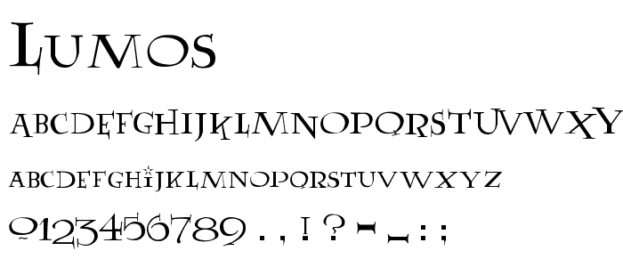
I downloaded Lumos and used it for econ notes in UG.
-
seatown12
- Posts: 614
- Joined: Fri Feb 20, 2009 9:16 pm
Re: Resume Font
There is conservative and there is "most conservative." If you think choosing Garamond over Times is too risky I don't know what to tell you.Anonymous User wrote:I don't think there is a better field in the word than law to take the safest and most conservative route with regard to any matter, large or small.
-
missinglink
- Posts: 946
- Joined: Mon Dec 07, 2009 12:49 am
Re: Resume Font
And pleasing to the eye - nice curves.chimp wrote:Really? Garamond strikes me as classy.NZA wrote:Garamond strikes me as too childish.
-
lawfirmrecruiter
- Posts: 625
- Joined: Thu Jun 16, 2011 1:28 pm
Re: Resume Font
Let me jump in here with a quick warning about fonts. Don't use fonts that are not universal to most programs and systems. I just received a resume that was sent in .PDF format and the fancy font got compressed when opened on our system. All the words came out as dots and squares - completely unreadable. It had to be sent to the IT department to get it cleaned up and converted to a readable format. Not all recruiters will take that time . . .
Best bet is to avoid downloading special fonts and just stick with the standards - Times, Arial, Calibri, Garamond, Century Schoolbook, etc.
Best bet is to avoid downloading special fonts and just stick with the standards - Times, Arial, Calibri, Garamond, Century Schoolbook, etc.
Communicate now with those who not only know what a legal education is, but can offer you worthy advice and commentary as you complete the three most educational, yet challenging years of your law related post graduate life.
Register now, it's still FREE!
Already a member? Login
-
seatown12
- Posts: 614
- Joined: Fri Feb 20, 2009 9:16 pm
Re: Resume Font
Sounds more like a problem with your Acrobat.lawfirmrecruiter wrote:Let me jump in here with a quick warning about fonts. Don't use fonts that are not universal to most programs and systems. I just received a resume that was sent in .PDF format and the fancy font got compressed when opened on our system. All the words came out as dots and squares - completely unreadable. It had to be sent to the IT department to get it cleaned up and converted to a readable format. Not all recruiters will take that time . . .
Best bet is to avoid downloading special fonts and just stick with the standards - Times, Arial, Calibri, Garamond, Century Schoolbook, etc.
-
Aston2412
- Posts: 466
- Joined: Wed Apr 21, 2010 11:23 am
Re: Resume Font
Awesome. I'm going to turn my next workproduct in with this ; )Dany wrote: I downloaded Lumos and used it for econ notes in UG.
-
ShiftyPig
- Posts: 126
- Joined: Sat Dec 06, 2008 3:18 pm
Re: Resume Font
I think font matters less than the overall cleanliness of the layout.
-
Cogburn87
- Posts: 467
- Joined: Mon Jul 13, 2009 11:26 pm
Re: Resume Font
One space. He makes a pretty irrefutable argument as well. I switched after reading it.jkay wrote: I am dying to know. One space or two after a period?
Seriously? What are you waiting for?
Now there's a charge.
Just kidding ... it's still FREE!
Already a member? Login